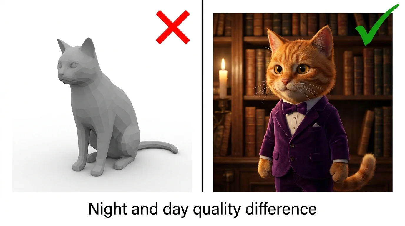
Mistake 1 - Being Too Vague
The most common mistake is giving the AI too little information. "A cat" produces a generic, forgettable image. The AI fills in every missing detail with random choices, and random choices rarely align with what you actually wanted.
Bad prompt:
"A cat sitting somewhere"
Fixed prompt:
"A fluffy orange tabby cat with emerald green eyes sitting on a velvet burgundy armchair in a cozy library, warm golden hour light from a nearby window, shallow depth of field, photorealistic, 8K"
Every detail you add removes one random decision. Subject, colors, materials, environment, lighting, camera - specify them all. Learn the full formula in our AI prompt writing guide.
Mistake 2 - Ignoring Art Style Keywords
Without an art style keyword, the AI defaults to a semi-realistic, generic look that pleases nobody. The style keyword is the single most impactful part of your prompt - it determines the entire visual language of your image.
Always include one of these:
"Pixar 3D render" | "photorealistic" | "anime illustration" | "watercolor painting" | "oil painting" | "cyberpunk digital art" | "comic book style"
For a complete breakdown of every style with visual examples, see our AI art styles guide.
Mistake 3 - No Lighting or Atmosphere
Lighting is what separates amateur AI art from professional-looking images. Without lighting keywords, you get flat, evenly lit images that look like cheap stock photos.
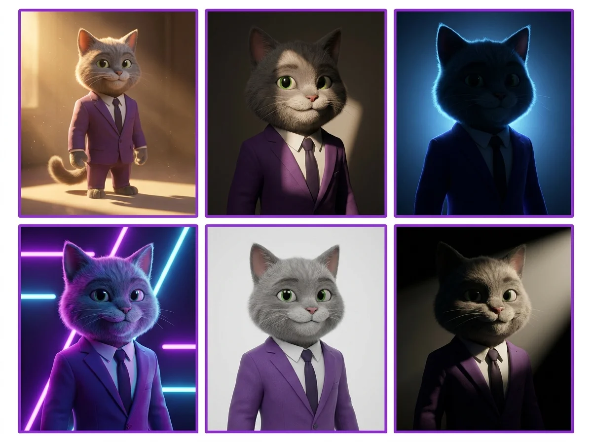
Add lighting keywords:
"golden hour lighting" | "dramatic rim lighting" | "soft studio light" | "neon glow" | "volumetric fog" | "Rembrandt lighting" | "moonlight"
Our camera angles and lighting guide covers every lighting technique with side-by-side comparisons.
Mistake 4 - Overloading With Too Many Subjects
Cramming too many subjects into one prompt confuses the AI. It cannot give proper attention to five characters, three buildings, two animals, and a vehicle all in one image. Elements merge together, proportions break, and the composition becomes chaotic.
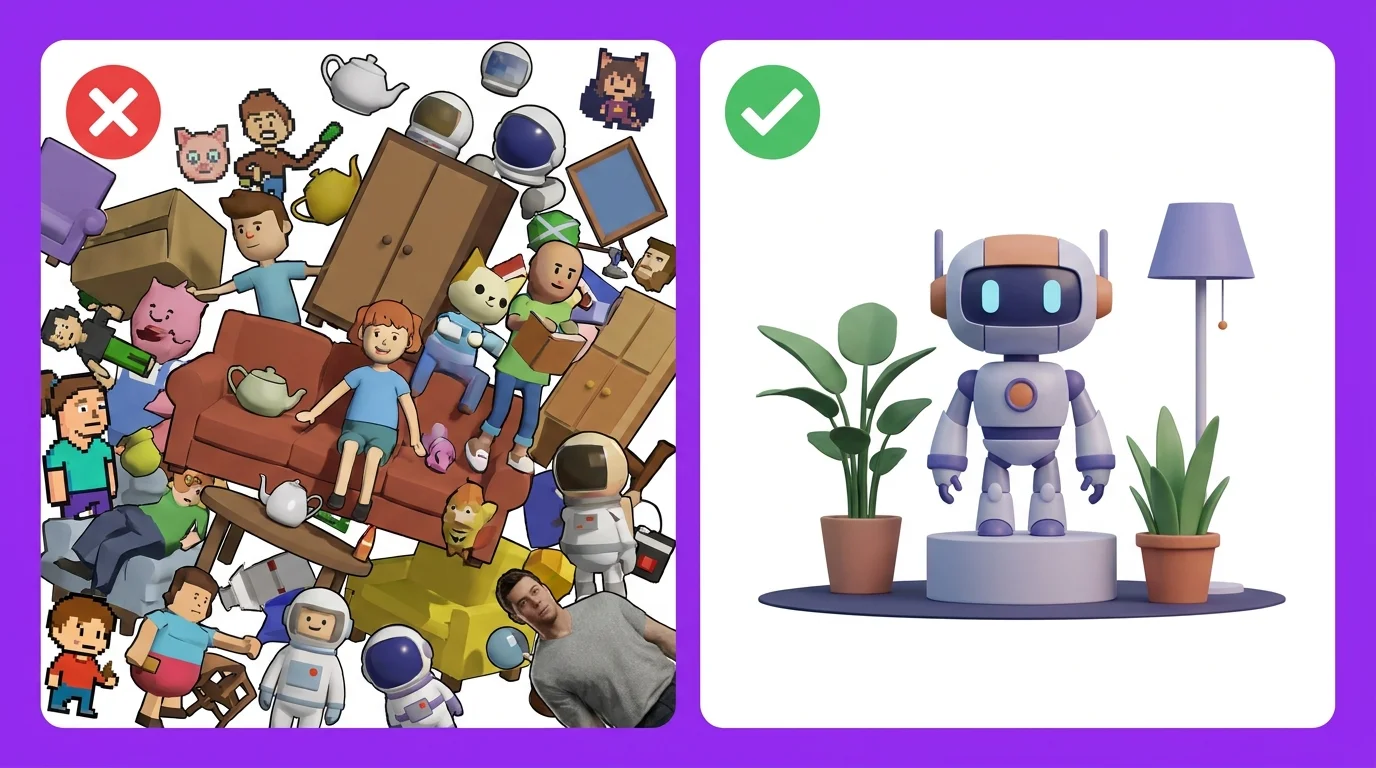
Rule of thumb:
1-2 main subjects per image. Need a complex scene? Generate elements separately and composite, or use inpainting to add details one at a time.
Mistake 5 - Forgetting Camera Angle and Composition
Most people describe what is in the scene but forget to tell the AI where the camera is. Without composition keywords, the AI defaults to a straight-on, eye-level, centered shot every single time. This makes all your images look the same.
Add camera direction:
"low angle hero shot" | "extreme close-up" | "bird's eye view" | "over-the-shoulder" | "wide establishing shot" | "Dutch angle"
Mistake 6 - Using Contradictory Keywords
Keywords that fight each other confuse the AI and produce muddy, incoherent results. "Minimalist ultra-detailed complex scene" is a contradiction. "Bright neon dark moody" pulls in two directions. "Photorealistic cartoon style" makes no sense.
Pick a direction and commit:
Choose one style, one mood, one lighting direction. If you want contrast (dark scene with bright element), be explicit: "dark moody alley with a single bright neon sign illuminating the scene."
Mistake 7 - Not Specifying Resolution and Quality
Without quality keywords, the AI settles for "good enough." Adding resolution and quality boosters at the end of your prompt pushes the model to produce sharper, more detailed output.
End every prompt with:
"8K resolution, ultra detailed, sharp focus, high quality, professional" - these keywords genuinely improve output quality across all generators.
Mistake 8 - Ignoring Negative Prompts
Negative prompts tell the AI what to exclude, and they are essential for clean results. Without them, you get watermarks, blurry edges, extra fingers, and other artifacts that ruin otherwise good images.
Standard negative prompt:
"blurry, low quality, deformed, watermark, text, signature, extra fingers, bad anatomy, cropped, worst quality" - use this as a starting point and customize for your needs.
Mistake 9 - Wrong Aspect Ratio for Platform
Generating square images for TikTok (which needs 9:16) or ultrawide images for Instagram posts (which needs 4:5) wastes generation credits and requires awkward cropping that ruins composition.
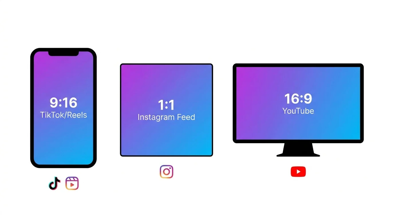
| Platform | Best Ratio | Midjourney --ar |
|---|---|---|
| TikTok / Reels / Shorts | 9:16 (vertical) | --ar 9:16 |
| Instagram Post | 4:5 or 1:1 | --ar 4:5 |
| Instagram Story | 9:16 | --ar 9:16 |
| YouTube Thumbnail | 16:9 | --ar 16:9 |
| Twitter/X Post | 16:9 or 4:3 | --ar 16:9 |
| Desktop Wallpaper | 16:9 or 21:9 | --ar 16:9 |
Mistake 10 - Not Iterating and Refining
Many people type one prompt, get a mediocre result, and give up. Professional AI artists iterate. They generate, evaluate what worked and what did not, adjust the prompt, and regenerate. Most great AI images take 3-5 iterations to perfect.
Iteration workflow:
Generate first attempt. Identify what is wrong (lighting? composition? style?). Add or change the relevant keywords. Regenerate. Repeat until satisfied. Save your best prompts as templates for future use.
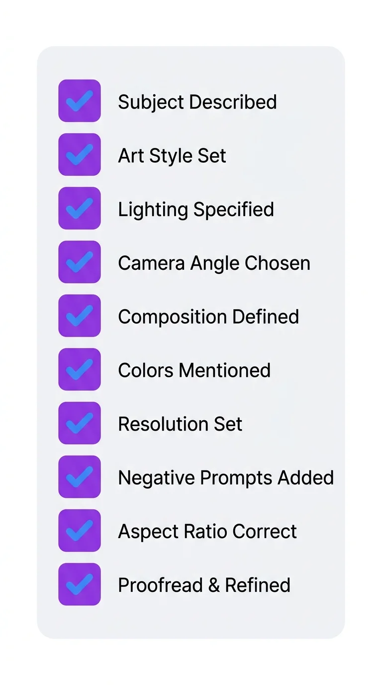
The Perfect Prompt Checklist
Before you hit generate, run through this checklist:
- Subject: Is the main subject clearly and specifically described?
- Style: Did you include an art style keyword?
- Details: Are colors, materials, and textures specified?
- Lighting: Is there at least one lighting keyword?
- Camera: Did you specify angle and composition?
- Quality: Are resolution keywords included?
- Negatives: Do you have a negative prompt set up?
- Aspect ratio: Does the ratio match your target platform?
- No contradictions: Do all keywords work together?
- Focus: Are there 1-2 subjects max, not 5+?